
Markel Internal Design System
A unified, extensible component library built to modernise Markel’s internal product ecosystem
Introduction
When I joined Markel, our internal applications varied widely in visual language, usability, underlying UI patterns and codebase conventions. As part of our broader initiative to modernise internal tools, I led the creation of a fully scalable Design System for use across the business, defining both the visual identity and the reusable component architecture for future Markel products.
This system is now the foundation for new applications and redesigns—including the ongoing One Workflow (1WF) transformation.
01. The Challenge
Across IT and business teams, several recurring problems became clear:
Inconsistent UI Patterns
Teams were rebuilding similar components from scratch, leading to:
- Visual differences between applications
- Duplicate (and conflicting) code
- Increased onboarding time for new developers
- Growing UI/UX debt
Lack of Shared Design Principles
Before the design system, there were no centralised standards for:
- Layout spacing
- Typography
- Colour usage and accessibility
- Form behaviour
- Component interactivity
- Iconography
This resulted in inconsistent user experiences and an increased need for rework.
Complex, Data‑Heavy Interfaces
Markel’s internal applications—especially underwriting tools—deal with dense data structures.
Teams needed consistent solutions for:
- Data tables
- Filtering and sorting
- Input validation
- Multi‑step flows
- Batch actions
- Navigational patterns
- Contextual menus and indicators (badges, icons, status markers)
Fragmented Technology Stack
Different teams used different UI libraries or custom-built components, complicating cross‑team collaboration and slowing development velocity.
– Example of original screen (pre design system)
02. My Role
As the sole owner and architect of the design system, I led:
- Research & foundation definition: design principles, tokens, accessibility standards
- Component architecture and implementation (Angular + Bootstrap)
- Documentation strategy for developers and designers
- Governance & contribution model
- Rollout & training across design, UX and engineering teams
- Continuous enhancement pipeline (based on feedback and evolving product needs)
I also actively partner with other designers in the UK business to ensure the system evolves collaboratively.
03. Vision & Design Goals
1. Create a unified, recognisable Markel interface
Establish consistent patterns and a cohesive aesthetic across internal tools.
2. Improve development efficiency
Enable teams to build new screens and applications significantly faster with high‑quality, pre‑built components.
3. Reduce cognitive load for users
Make cross‑system experiences feel familiar and predictable.
4. Support enterprise‑level complexity
Ensure components can handle:
- Large datasets
- Nested structures
- Dynamic and conditional logic
- Accessibility at scale
- Performance‑heavy interactions
5. Build for evolution
Provide versioning, component guidelines, and extensible architecture so the system can grow with Markel’s needs.
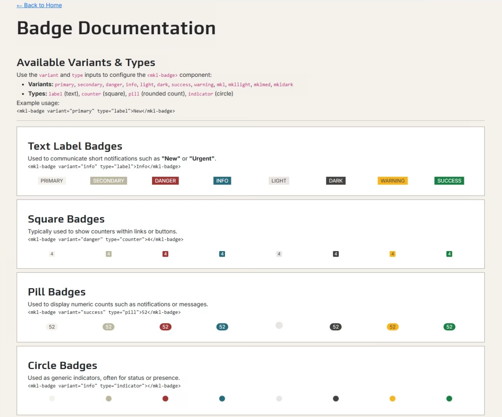
– Example component documentation for developers (Badge)
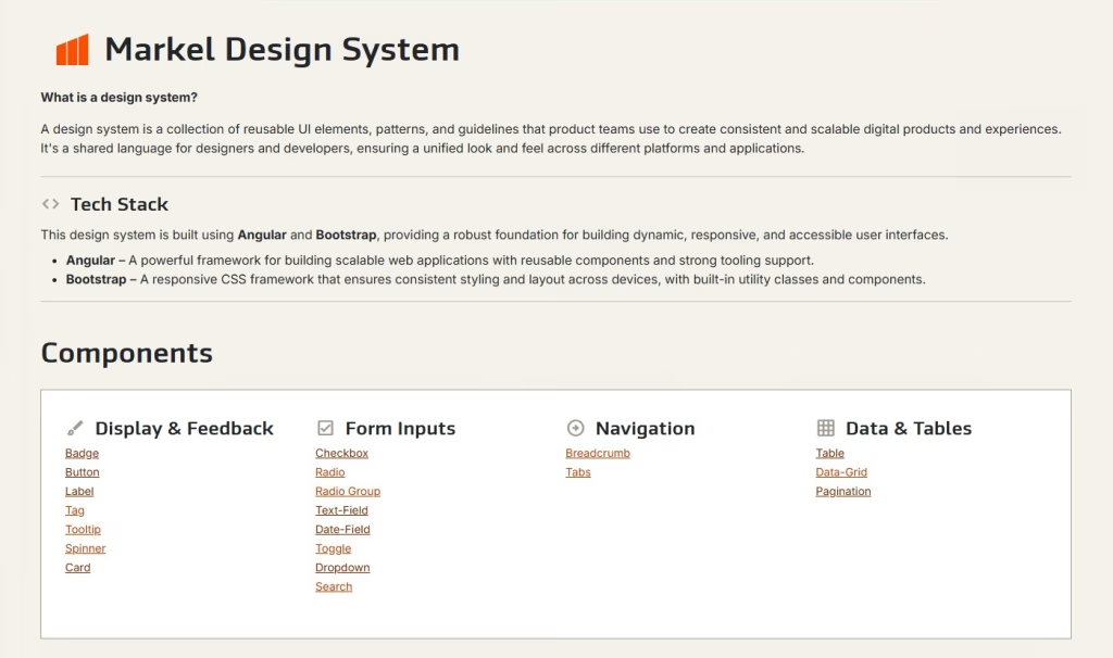
04. Foundation & Architecture
The design system is built on:
Technology
- Angular (component-based architecture, scalable state patterns)
- Bootstrap (grid, responsive layout, utility classes)
- Custom SCSS token library for colours, spacing, typography
- Reusable services for UX behaviours (modals, notifications, async loading states)
Core Foundations
- Colour system with semantic tokens (e.g., success, warning, info, severity indicators)
- Typography scale optimised for data‑dense environments
- Spacing system for layout consistency
- Accessible interaction patterns for keyboard and screen-reader support
- Icon library aligned with use cases across operations, underwriting and analytics
05. Components
Below is a snapshot of key components developed so far.
1. Data Grid (mkl-data-grid)
One of the most complex and heavily used components in the ecosystem, built to support:
- Server-side async data loading
- Configurable columns, data types and validation
- Badges, icons and conditional formatting
- Row‑level and cell‑level menus (kebab actions)
- Pagination
- Sorting and filtering
- Multi‑select
- Custom renderers for statuses and business rules
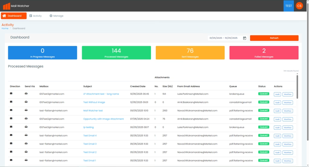
This component is now being integrated into the MailWatcher (an email sorting application) dashboard and upcoming 1WF screens.
2. Form Components
Standardising the entire form experience including:
- Input groups
- Dropdowns
- Date pickers
- Validation patterns
- Inline help and error states
- Multi‑step/ wizard structure patterns
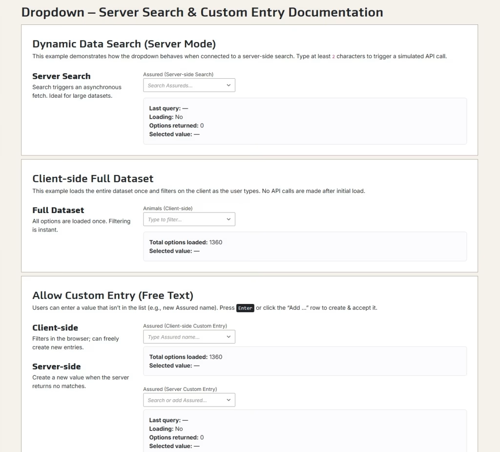
– Example component, dropdown – client & server side compatibility
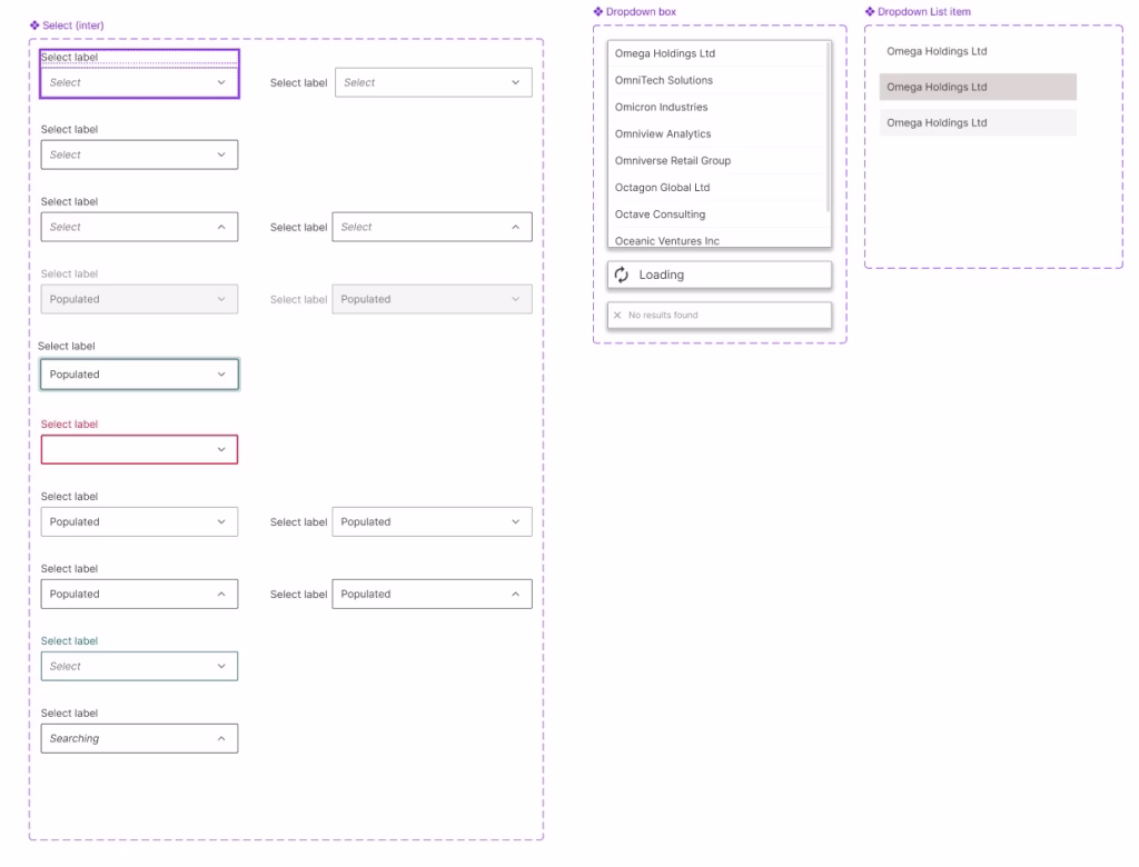
– Figma based dropdown component
3. Navigation Patterns
Shared patterns for:
- Top-level and in-page navigation
- Tab systems
- Vertical side navigation for complex workflows
4. Status Indicators & Badges
Used heavily in 1WF for:
- Pricing status
- Submission lifecycle
- Risk categories
- Workflow actions
5. Buttons & Interaction Elements
With consistent variants:
- Primary / secondary
- Destructive
- Quiet / subtle
- Icon-only actions
- Loading and disabled states
– Design system documentation home page
06. Governance & Contribution Model
To ensure the design system remains stable, scalable and trustworthy, I established:
Documentation & Guidelines
- Component behaviour and limitations
- Usage guidelines and anti‑patterns
- Code examples
- Accessibility notes
- Version release notes
Feedback Workflow
- Teams can request enhancements or new components
- I work with BAs and developers to validate the need
- Perform UX review, technical feasibility check, then development
- Components tested inside our reference/dummy UI before adoption
Change Management
- Semantic versioning
- Upgrade guidance for teams
- Roadmap planning for new components and improvements
07. Adoption & Impact
The design system is already driving value across the business:
Faster Delivery
Teams no longer build components from scratch—reducing development time and rework.
Consistency Across Products
Markel applications now share a visual and functional language, improving user confidence and reducing training overhead.
Better Quality & Accessibility
Reusable solutions ensure accessibility standards aren’t an afterthought.
Alignment with 1 Workflow
The design system underpins new 1WF screens, ensuring consistency between Submission Creation, Policy Page, Pricing and Task redesigns.
Scalable Future
The system is built to expand into:
- Data visualisation
- Advanced analytics components
- Notification system
- Cross-application behaviours
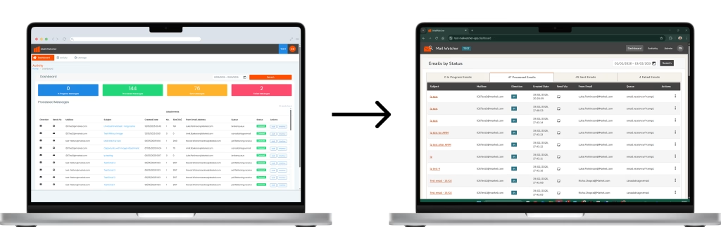
– Design system Implemented into its first application, an email management system
08. What’s Next
I’m currently working on:
- Expanding the grid component for more complex underwriting workflows
- Building a notification service
- Enhancing the documentation site
- Creating role‑based UI patterns for underwriting vs processing teams
- Introducing global layout templates for upcoming applications

Public Sector Service Consolidation
Can a users identity be verified to access public digital services? How do we approach designing a service for such a broad range of customers?