Netscapes
Week 1
1. The brief
The Future Web (INDE601)
In this module we will develop an internet based system that utilises contemporary development methods for Web and Internet Technologies

2. The Ethics
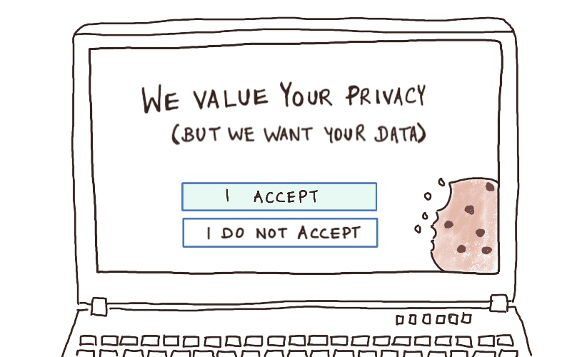
During our first lecture we had an interesting discussion in regard to the ethics of being a creator online. Whether you’ve developed a new social media or simply collecting people’s data for a scientific survey. To what degree can you be held accountable for what is put on the internet.
“Many politicians and onlookers feel that Mark Zuckerberg, the boss of Facebook, has been irresponsible in his oversight of the world’s largest social-networking company. Facebook has spent the past 18 months defending itself against pointed criticism, including allegations that it has done too little to stop the spread of fake news and extremist propaganda”
The Economist
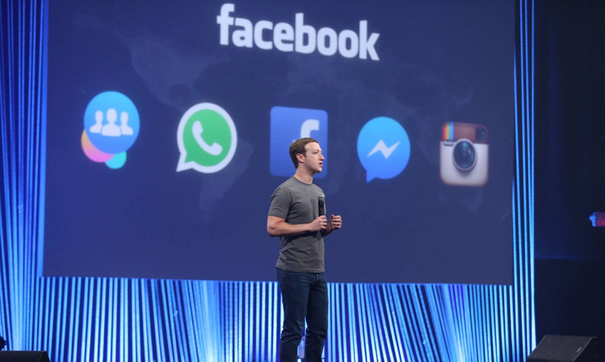
Mark Zuckerberg has been held accountable for the content of his social media platform FaceBook. But is this fair? Only recently have we had to ask ourselves these questions as they are new issues. FaceBook is only about 17 years old and when it was first created it was only intended to connect a community of students. How can we hold Mark Zuckerberg responsible for the posts and profiles of FaceBook’s 2.89 billion users. You just can’t.
In another example, the manufacturer of weapons is never held responsible for who those weapons harm, so why is it different with social media? FaceBook is simply a platform in which most people have the privilege of using. It can be a great tool to connect with people and stay aware of current affairs. However if the platform is misused, in terms of the conditions the platform provides, that privilege should be taken away.
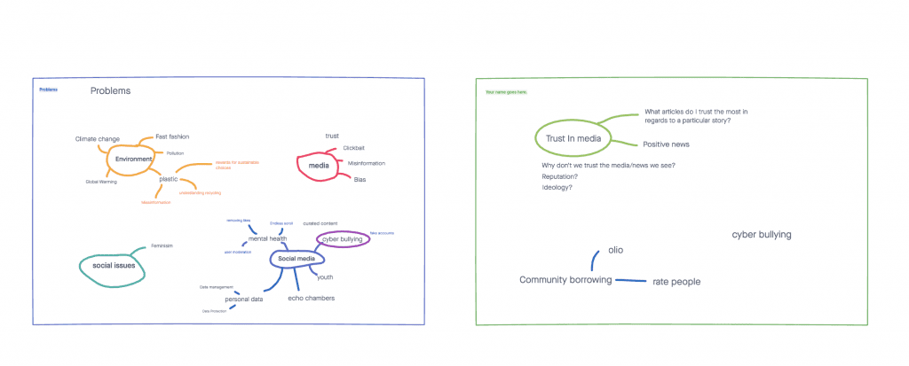
In order to start our ideation process we decided to mind map some of our initial ideas. These seemed to all revolve around a form of ethical issue. We spoke a lot about the impacts of social media and mental health, we also looked into ideas surrounding the environment. Out of these our strongest ideas were considering how to combat the mistrust in media and the spreading of fake news, or an app to be used to encourage the sense of community in a local area, making it easier for people to connect and help one another out.
2. invision mind mapping
We wanted to keep on the theme of creating an ethical app, therefore we continued researching and considered an idea around the more efficient use of electricity in the home. An app that could schedule certain devices around the house to run when the price of electricity was at its lowest, meaning consumption was at its lowest.
This would help spread out the demand for energy meaning that there would be less demand to use energy supplied from unsustainable sources.
3. Refining our idea
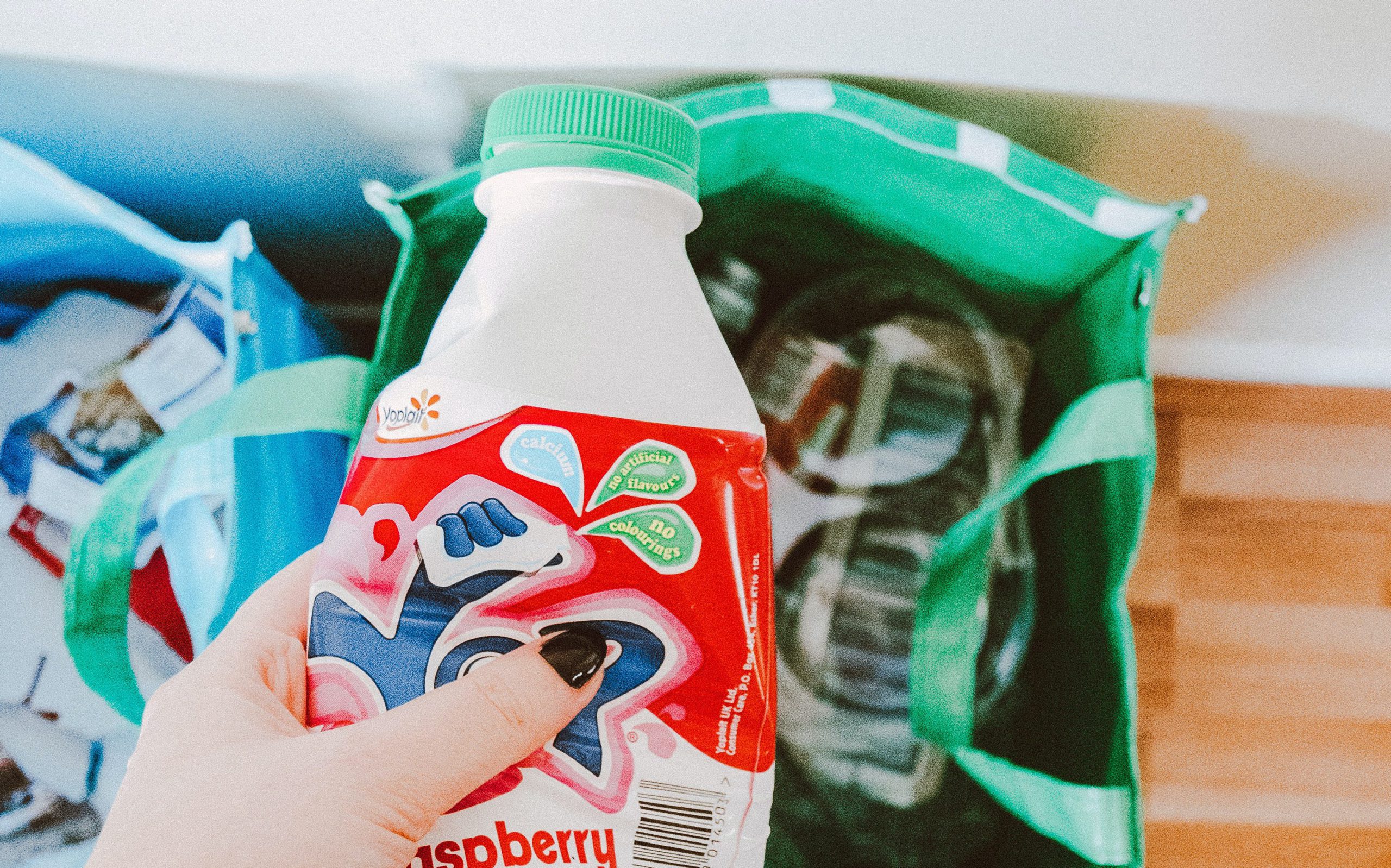
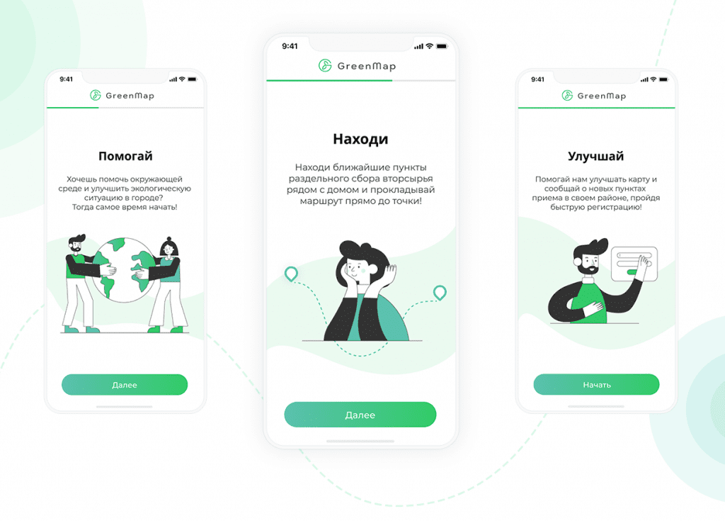
After a bit of research, we decided to continue with the ideation process and the energy app wasn’t particularly feasible. We wanted to keep along the lines of creating an ethical app that has a positive contribution to society. We went back to our mind maps and looked into the idea of community and how it can come together for a better cause. We then came on to the idea of recycling as we feel like there is still a lot of confusion and misinformation around the rules of recycling. We felt we could create an app with image recognition or barcode scanning that could provide information about how to recycle that product. We decided on a problem statement:
“How do we help people to go with more sustainable choices in regards to disposal of items.“
Week 3
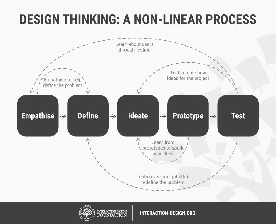
1. Design Thinking
What is Design thinking?
Design Thinking is a process designers use to unlock alternative strategies and solutions by taking a user focused approach.
Lecture presentation
2. Phases of design thinking
- Empathise
- Define
- Ideate
- Prototype
- Test
Design thinking is necessary in the process of ideation and creation. Similar to the phrase ‘think outside the box’ it helps designers to not default to the same design approach on every project. Every designer has a particular style, likes and dislikes, but it’s important to base your design choices around the project requirements rather than your own personal preference. This is why the process of design thinking can help. The purpose of design thinking is to base all decisions around the user, to put the target audience at the centre of the design process
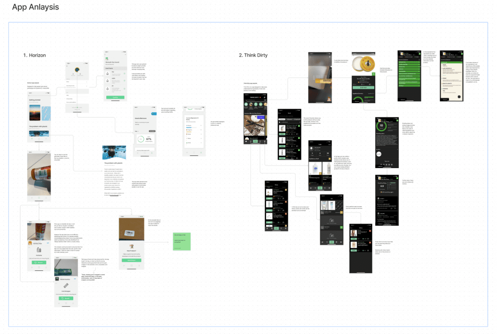
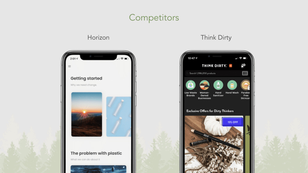
3. Market Research
In order to refine our app idea, we decided to do some market research on a couple of other apps that used similar technologies and concepts. This could then give us an insight into what’s already on the market and what works and what doesn’t work.
Example of horizon analysis
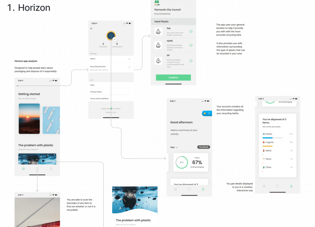
4. Horizon app
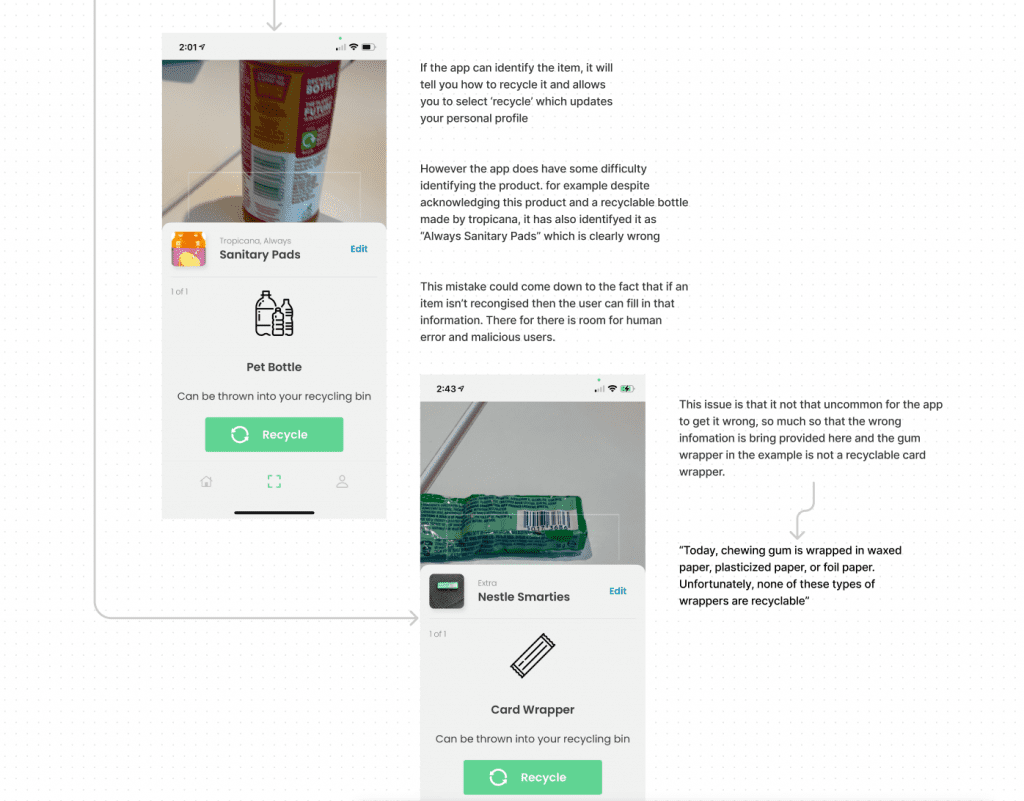
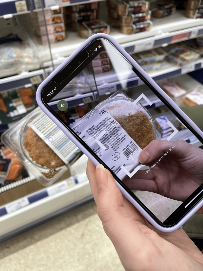
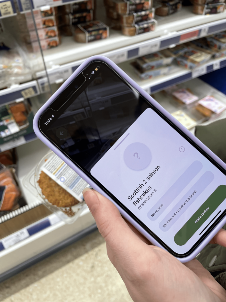
The first app I looked at was called ‘horizon’. In concept it was very similar to our app idea. However they target the ideas after they have been purchased rather than trying to influence their users to make better choices in the first place.
The app also had a lot of problems identifying any of the products, nearly all the items I tested returned the wrong product name. In some examples the product returned would be so wrong it would give you the wrong recycling information. Such as the gum wrapper being returned as a Smarties wrapper, and telling the user it was recyclable as cardboard, which defeats the whole purpose of the app as gum wrapper is made of mixed materials and therefore is not recyclable.
To get around this we decided to use web scraping, instead of user input, to find and return the product name, so in our case the name associated with the product should always be right.
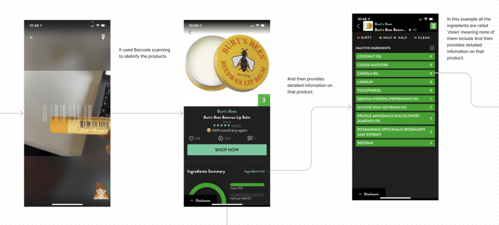
5. Think Dirty app
The Think Dirty app is a much more established and sophisticated version of horizon however focuses solely on skincare and makeup products.
Think Dirty’s personal description:
“We empower ingredient-conscious consumers to choose the safest beauty, personal + household products!”
thinkdirtyapp.com
This app also uses barcode recognition technology to identify a product and its ingredients, which then returns a score between 0 and 10 (10 being very ‘dirty’ or unsafe in terms of ingredients).
Week 4
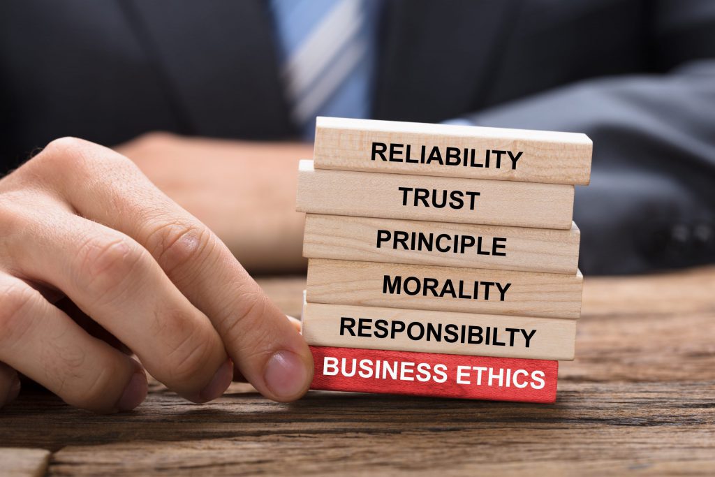
1. Ethical Design
Ethical design is designing great products alongside your morals and beliefs and the principles of your business. What you create, whether a website, a marketing campaign or a product, has an effect on real people and those effects can create ripples.
Carrie Sownie
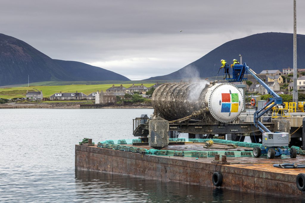
2. Microsoft Datacenters
Microsoft has recently just proved that underwater datacenters are feasible. The sealed containers containing the datacenters are placed underwater in the North Sea off the coast of Scotland’s Orkney Islands. On land, corrosion from oxygen and humidity, temperature fluctuations and bumps from people can contribute to equipment failure.
Not only are these datacenters a much more efficient use of energy compared to their on land counterparts, they also provide a home for a variety of marine life, which grew on its surface.
This is an example of ethical design as Microsoft has innovated a way to operate datacenters that use energy far more sustainably. This technology could save huge amounts of energy each year if adopted by a variety of companies. The consideration for the environment and future of the planet is evident in the product.
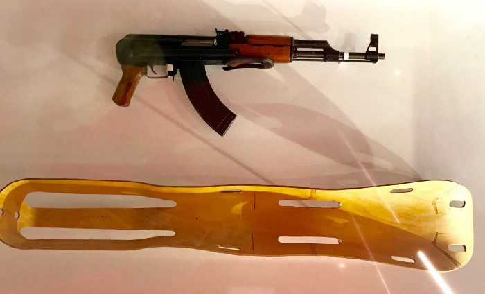
3. Good design
I saw an exhibition in the Design Museum in 2017 simply titled “Gun and Splint”. It was a commentary on what is considered “good design”. Both items successfully do what they have been designed to do, however one was created for healing and on for hurting. The exhibition was designed to get the viewer to question what defines good design? Is it, it’s ability to fulfil what it was designed to do, or does it have to have a positive impact in some way?
Week 5
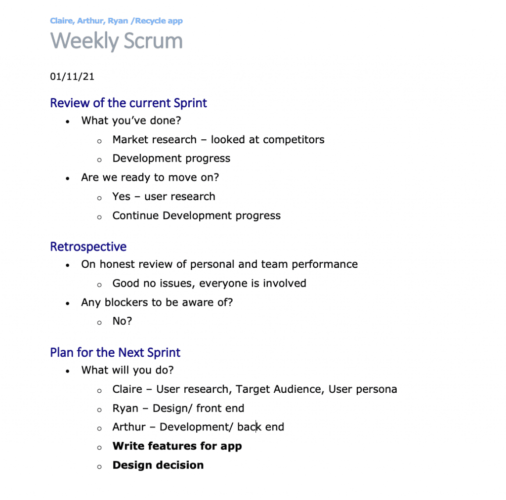
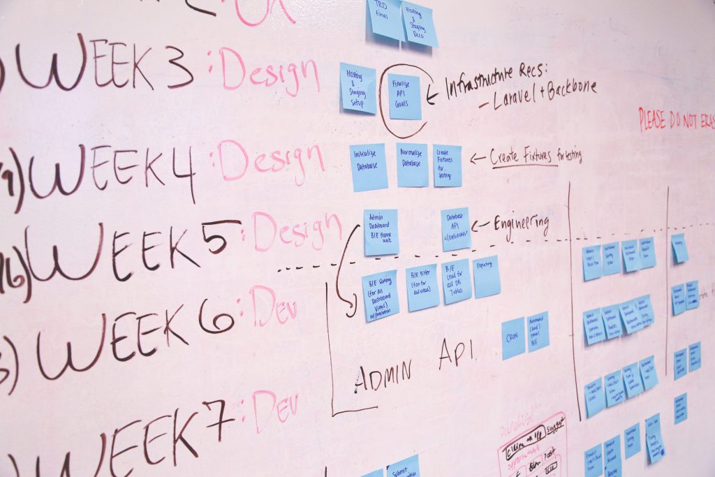
1. scrum meeting
In order to prepare for our first scrum meeting we filled out the weekly scrum template.
I think we were in a good position, as we had completed some market research and refined our idea. The next steps were to write down the key feature we want to include and the ‘nice the haves’. We also need to define our target audience as this will have a serious impact on our design decisions.
1. Market research
Next we decided to narrow down our target audience. We answered a set of questions in relation to our mission statement ( How do we help people to go with more sustainable choices.)
Q1. Who our likely users are and what they’re trying to do?
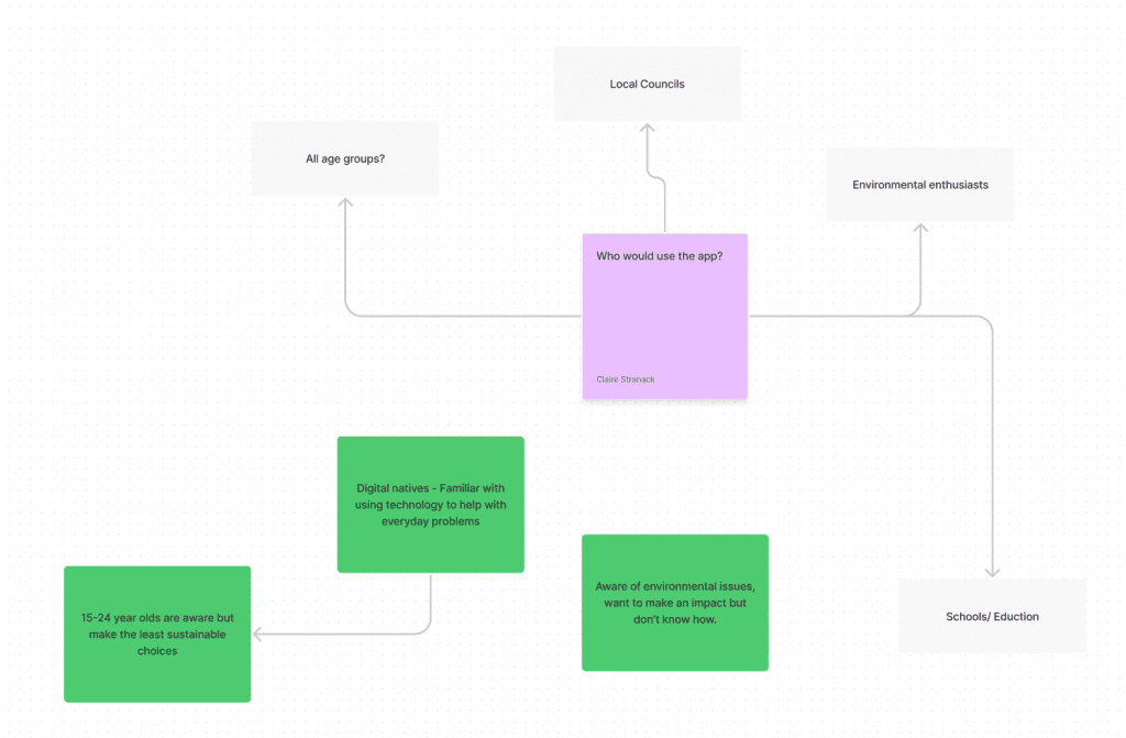
I created a mind map to reflect our initial target audience assumptions, this helped us find a more specific route to target, the audience who would benefit most from the application. Through this process, back with a bit of research, we determined that the younger demographic between 15-24 year olds were the most appropriate target audience as they are typically quite aware of environmental issues, but don’t know how to make an impact.
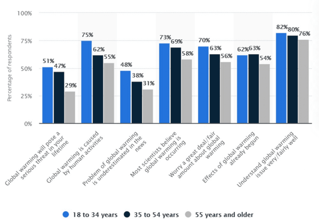
These 2 data sets show that younger people seem to be more aware of the environmental issues, but table 1 suggests the older population are actively doing more about it. This is why we want to create an app that would help the younger demographic do more to help the environment.
Q2. How they do it currently (for example, what services or channels they use)?
- Search engine research
- Brand recognition & sustainability marketing
- Local recycling website & bin stickers
- Think Dirty – Sustainable makeup and skincare choices
- Horizon – Recycling information
Q3. The problems or frustrations they experience?
- Prices of items, is there an alternative?
- How do sustainable factors contribute to the overall sustainability of an item?
- Takes too long to find this information
- They don’t want to take the time to learn, want to know sustainability information in a digestible, easy manner
- Recycling itself it flawed so people can be bothered
- Sustainable alternatives are too expensive
Q4. What users need from your service to achieve their goal?
- Easy access to the sustainability information of a product.
- Clear and digestible interface
- Accurate product information
4. scope
We also defined our scope in order to get a real idea of what we can create:
Features:
- Users rating
- barcode scanning
- Web scraping names of product
Nice to haves:
- Moderation
- Shopping list functionality
- Overall shopping list rating
- Brand rating separated from product rating
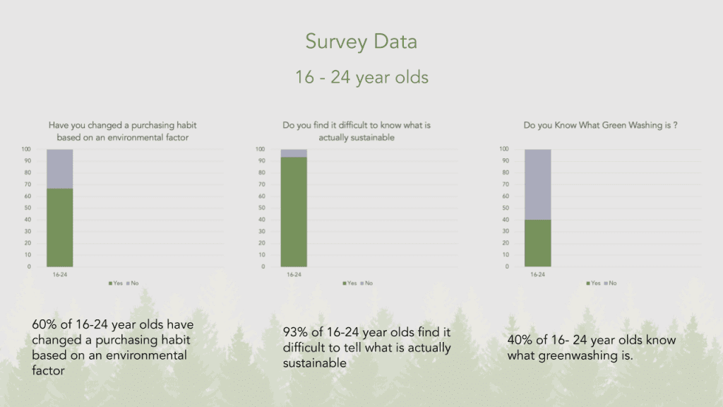
5. Survey
To add some credibility to our answers we conducted a survey. This will help us gather data and allow it to influence our design choices. The questions we asked are as follows:
- How old are you?
- Are you interested in learning more about sustainability?
- Have you changed a purchasing habit based on an environmental factor?
- Are you conscious of the sustainability of products you purchase?
- Do you find it difficult to know what is actually sustainable?
- Are sustainable alternatives to products too expensive?
- Are you willing to make a conscious effort to make more sustainable choices?
- Do you know what greenwashing is?
- If you do know what greenwashing is, does it make it harder for you to make more sustainable choices?
- Would knowing the sustainability score of products you use help to change your shopping decisions?
Week 6
1. Presentation
We used our survey data to influence the design and functionality of our app. We discovered that the 16 – 25 year old demographic aren’t not very confident in their knowledge of sustainability. They are keen to try to make changes but are unsure if their actions are making a difference.
Our presentation demonstrated the need for our app and the gap in the market. I discussed the survey data and explained what we learnt from it and talked about our competitors. What we liked, such as the community and rating feature of the think dirty app, and what we didn’t like, such as the bad user input and incorrect information from the Horizon app.
The presentation gave us some feedback that allowed us to improve our concepts as we continued with this project. However, due to the small audience we were pitching to, the general feedback was limited and there weren’t many perspectives to take into consideration.
Week 7
1. Design
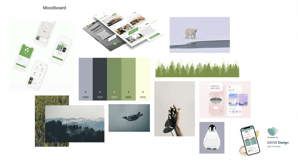
To start creating the visuals for the app, I created a moodboard to get an idea of how the app would look.
I want the app to be quite minimalistic as our target audience are young adults. This demographic is generally quite familiar with mobile apps. However, for an app of this nature convenience is very important, the users need to feel as though the app is worth their time to use, hence why finding the sustainability score of the product must be quick and easy.
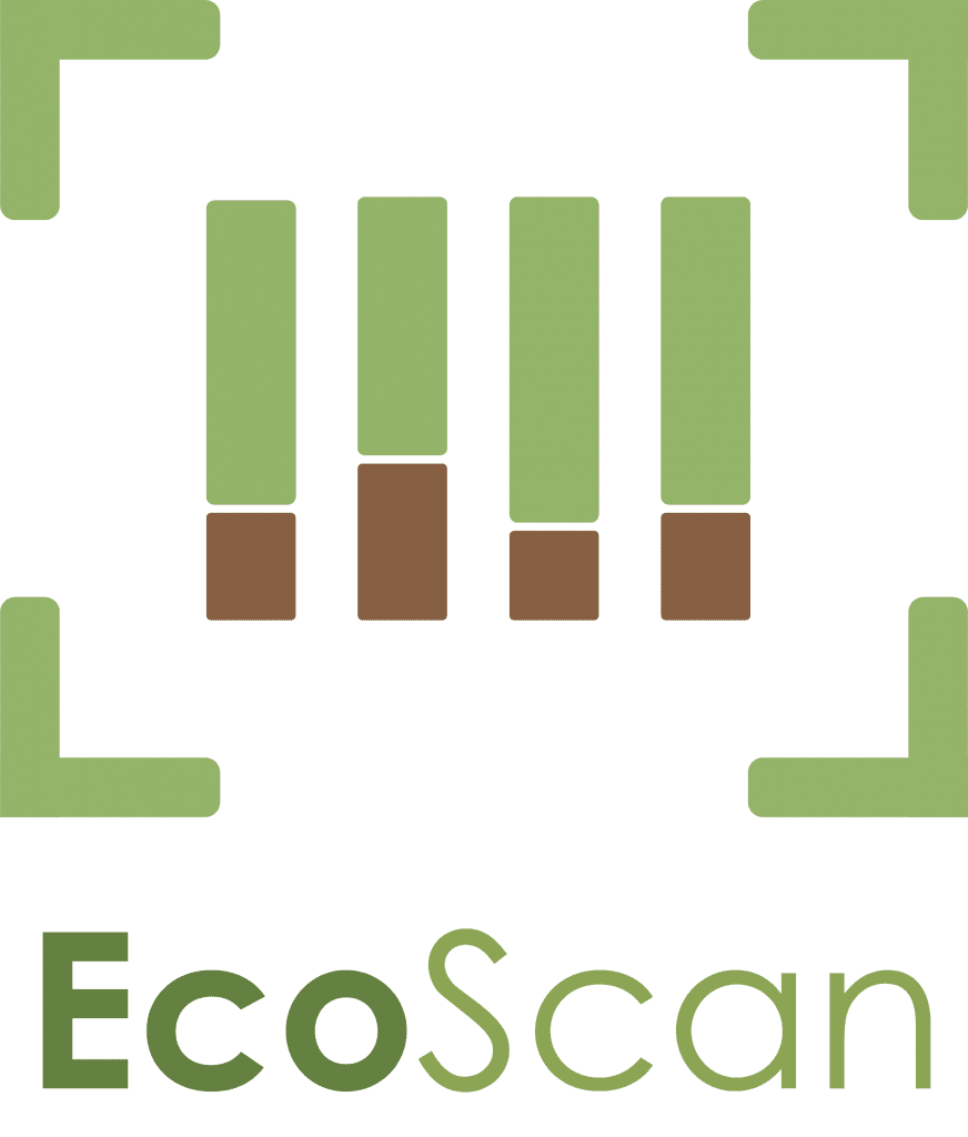
2. Logo Evolution
We wanted our logo to represent our brand and the purpose of the app. It needed to be recognisable so it took a couple of versions before we got to our final design. Initially I wanted to emphasise the barcode becoming a forest as the aim of our app is to influence what people buy in order to better the environment. I liked the message behind the first design, and it’s not something I wanted to lose in future versions, however the design was a little too complex for a logo especially if it would be viewed primarily on a mobile screen. Therefore I went through two rounds of refinement to finish with a clear but concise design that describes the app in a simple but engaging way.
Week 8
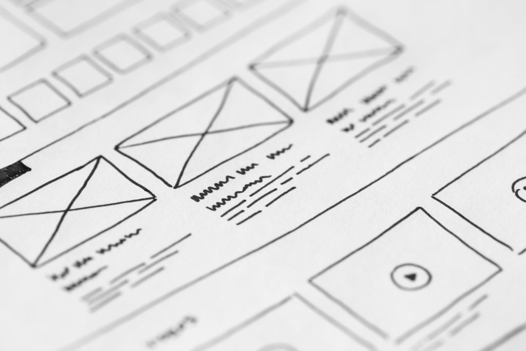
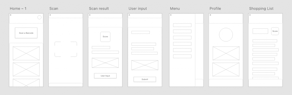
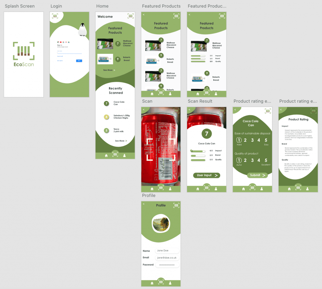
3. Initial Wireframing
I initially created some rough wireframes to outline each page and the general content they would include.
4. Design theory
In each application, the user interface (UI) must have a very clear goal or action. The UI on a screen should lead the user through each action quickly and easily.
Navdeep Raj
I was in charge of the app design for this project and I wanted to carefully consider the UX design of the app to make it as practical and easy to use as possible. Our audience will typically be opening the app to quickly scan an item and see the product rating. Therefore the app needs to cater to this use. I wanted to look into some of the fundamental laws of UX to get a better understanding of how the design and impact usability. I found 3 laws in particular that were most relevant to our app.
1. Hick’s Law
“The time it takes to make a decision increases with the number and complexity of choices”
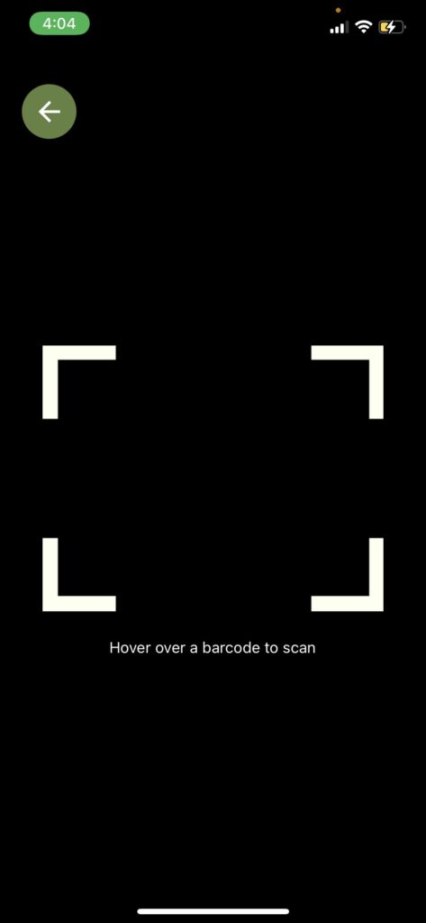
The Hick’s Law is very relevant to the usability of the app, as mentioned before, it is critical we make the app as efficient as possible, in order to keep our users satisfied. We want the app to be easily accessible and the functionality as efficient as possible to avoid our users having to wait or making multiple decisions in order to reach the outcome. This has influenced the design of our app to include an easily accessible menu, with the barcode scanner button, the largest in the menu so it’s easily identifiable.
“People judge an experience largely based on how they felt at its peak and at its end, rather than the total sum or average of every moment of the experience.”
The Peak-End rule is important to consider in every user process. It’s critical for the users to have a positive experience with our app as we want them to feel the need to use it on a daily basis if necessary. The Peak point of the experience would be the barcode scanning of the item, it’s therefore important that the barcodes are recognised quickly and easily. From a design perspective I can create enough screen space to display the cameras view, and apply a suggestive box to hold the barcode so it can be recognised as easily as possible, a ‘nice to have’ would be some suggestion that appear if the camera hasn’t picked up a barcode within a certain amount of time. Such as ‘make sure light isn’t reflecting off the barcode’ or ‘ hold the barcode as still as possible’
“Users often perceive aesthetically pleasing design as design that’s more usable.”
I believe the functionality of our app will work as planned, however as we are relying on various technologies such as web scraping, which has a chance of being temperamental, it’s important that our design is engaging and has a sense of usability. I want the app to feel modern and pleasant to interact with, I feel movement can really create a sense of sophisticated UX when it’s well implemented.
Week 9
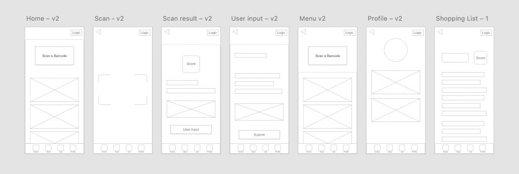
1. Refining Wireframes
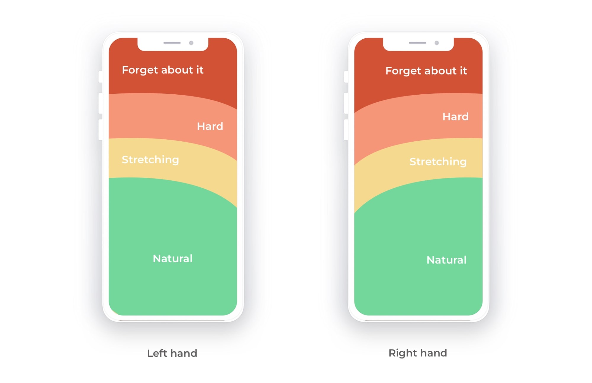
Based on the research around the laws of UX, I developed the initial wireframes to reflect a more sophisticated level of design. I moved the navigation from the top left corner, which is typically very out of reach on a standard smart phone, to the bottom which is far closer to the user’s fingers, as you can see in the diagram of comfortable thumb reach. The new menu location is much more accessible, and doesn’t require being pressed to view all the options, this reduces the number of buttons the user has to press and therefore reduces the number of choices that need to be made. The barcode scanner button, which will be central in the menu will be very easy to reach. As the menu will be accessible from every page, it will also be clearer to the user which page they are on based on what button in the menu is greyed out/selected.
Character
The use of a character in applications has proven to increase engagement amongst children. Our app is targeted to adults but some studies suggest that characters also influence choices adults make.
For adults, liking a media character is associated with perceiving the character as a role model and increased efforts to imitate the character. Similarly, adults are more involved with characters that they like versus dislike, which includes motivations to imitate behaviours that characters are rewarded for.
Rebecca M. Chory
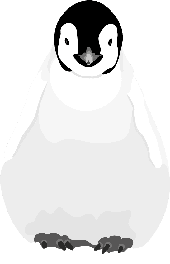
I felt that it was very important for the character, if we choose to include it, not to feel too childish or become a distraction as our app, foremost, is about practicality. I created a potential version of what our character could look like using Adobe Illustrator.
Week 10
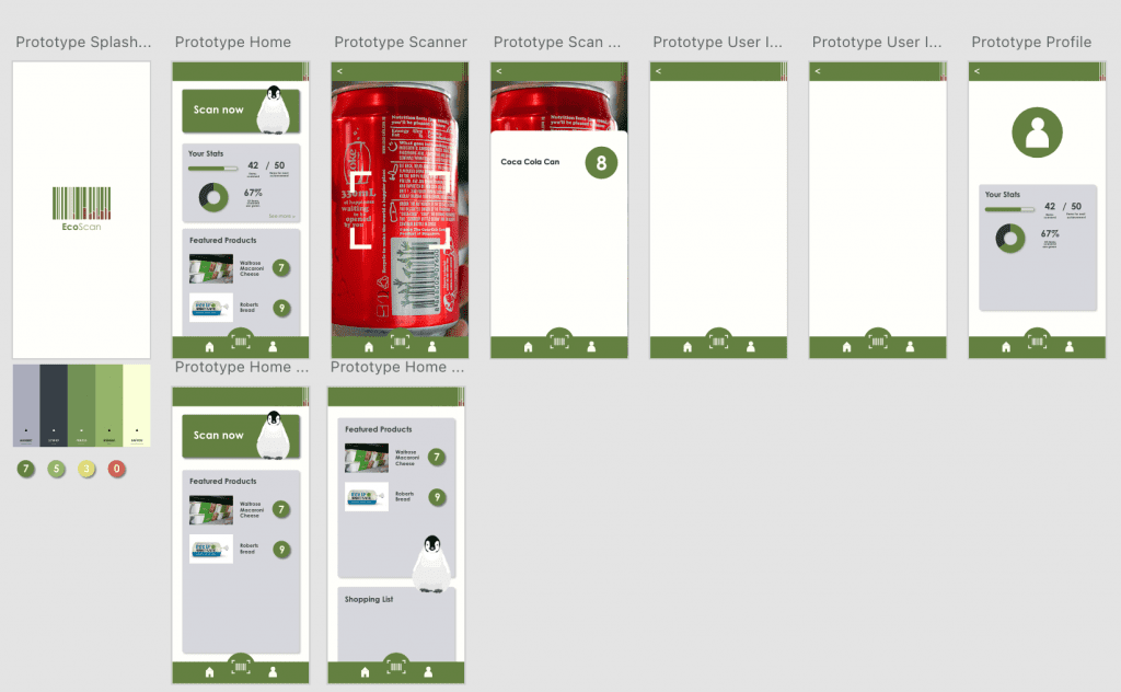
1. Prototyping
In the initial version of our prototype I lay out all the pages and included the menu navigation. I began filling in the pages with content, however before I got very far with this design I quite quickly got bored of it. It felt quite bland and uninteresting despite there being almost too much content. So I decided to start the process again with a new approach to design.
I looked at the moodboard, and various recycling apps on Behance, and found some inspiration for our app.
I liked these designs in particular as the shapes gave the app more character, it’s interesting to look at and feels modern.
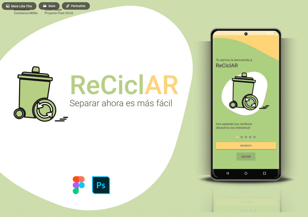
1. Prototyping round 2
In the second round of prototypes the design felt a lot better, I think it reflects the message of the app better and feels a lot more complete. There are still improvements to be made as I think the app feels slightly too childish for the target audience, especially the product rating page. I think I need to refine the colour and not have so many of the rounded shapes. In general, the app does however feel more functional and easy to interact with, I think the buttons and navigation are clear and no longer over complicated.
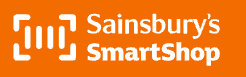
We noticed that the Sainsbury’s smart shop logo is quite similar to ours however we don’t think this will be a problem as despite them both using the general recognised barcode scanning icon, we made very different use of colour and the shape of our icons even the placement of our brand names are very different, so I don’t think there would be any confusion between the icons.
Week 11
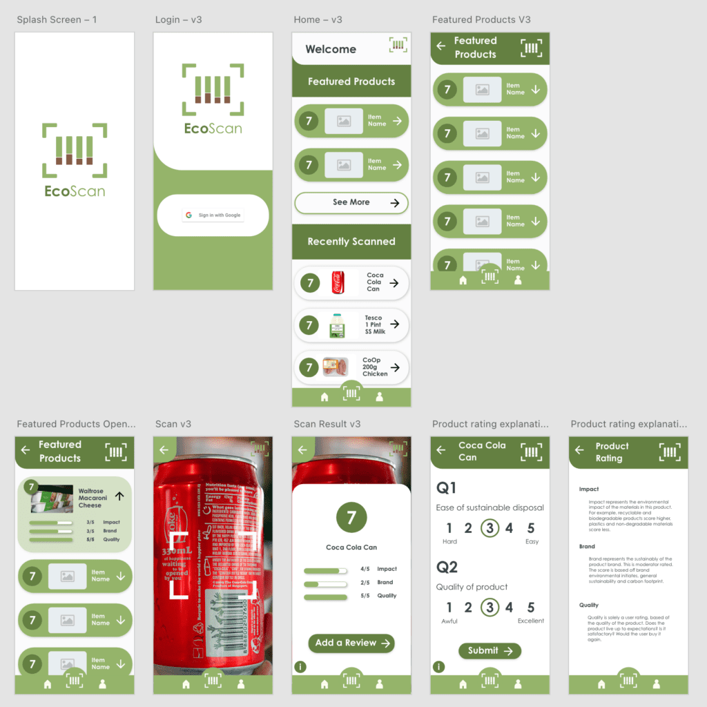
1. Refining Prototypes
Based on discussion with Ryan about feasibility of the first design I went on to create a similar but slightly more refined version of the app. The design definitely felt the most complete out of all the versions I had created. However due to a slight misunderstanding and increasing time pressure Ryan began developing based on the previous design. Therefore the final design includes elements of both prototypes which consequently turned out looking good. Initially Ryan wasn’t confident in creating the shapes from the pervious design but managed to. So they were worth including as they bring the app to life much more than the more basic geometric shapes.
Week 12
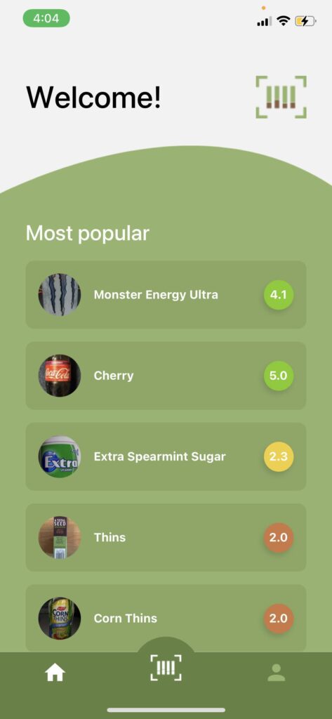
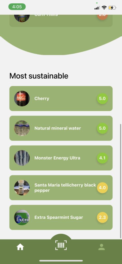
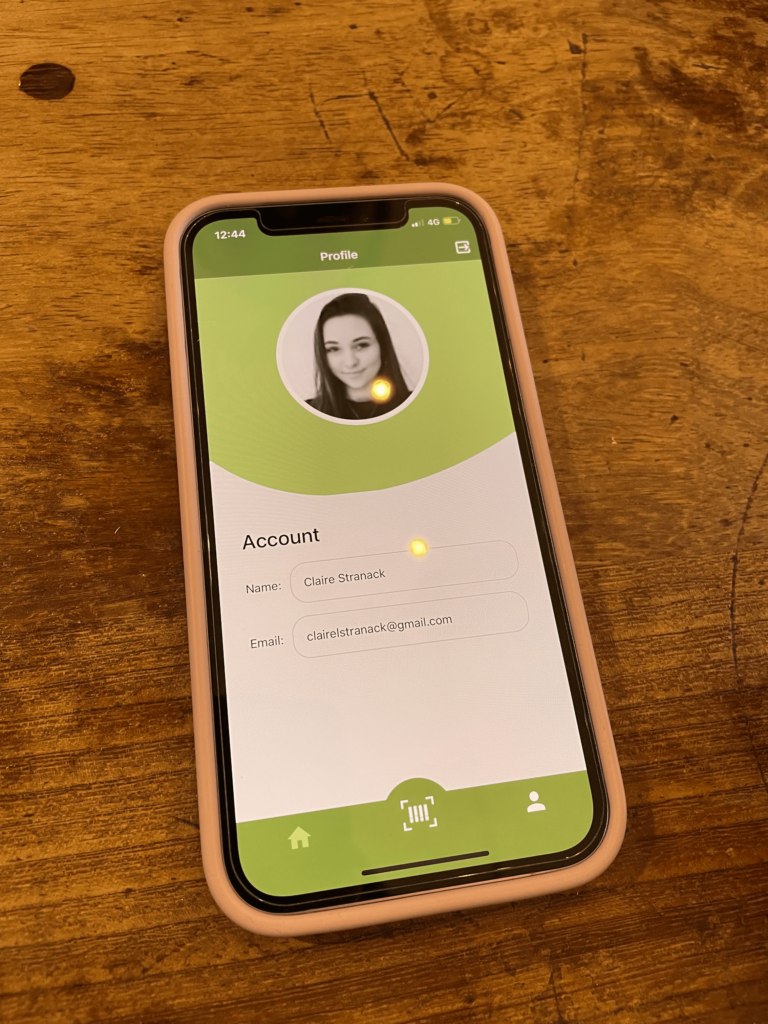
1. The app
Once the development stages were almost complete I could access the app via Testflight. I think the design is refined and sophisticated and we’ve avoided having an over cluttered home screen like many of the other barcode scanner apps I looked at. The app is easy to navigate and the menu is very accessible.
Week 13
1. The Presentation
To present our project we created some slides. I spoke about the processes and methodologies we used throughout this project such as design thinking, and how that influenced our work. Design was a big part of my role in this project and I was able to explain design decisions and outline the prototyping process.
Closing thoughts
In conclusion, Netscapes was both a challenging and valuable module. It was the first time I have worked in a group where all our roles were so different and required us to be completely in charge of a section of the project. I like how we took such a structured approach in tackling the tasks, making sure our methods were ones used in industry. At times the collaborations became challenging when we all had work to get on with, our communication lacked, this was made harder by incomplete scrum meetings. However, as the project progressed we got better at keeping in contact and held various zoom meetings when necessary.
In general I learnt a lot from this project, and was also able to apply lots of knowledge learnt, from both my placement and previous years at university. As a team we worked very well together and I felt we ran operations using industry standard methods, which is great preparation for the future.