
RescueLife streamlines the process of finding a rescue pet. It does this by allowing all the rescue animals across the country to be on one site. Not only that, but it is also a fun and interactive social media where you can keep up to date with rescue animal stories.
Research
I have included some of the highlights of my research so far. I tried to look at a variety of sources such as articles, websites, books and podcasts.

Initially it was important to research around my topic a bit to define the problem I was trying to solve. I looked into the process of adopting a pet and how that differs from the process of buying one. I then looked into some of the stats surrounding adoption and rescue shelter, a couple of which I included in my promotional video. Here are some further stats.
- Over 50% of dogs entering UK animal shelters are not spayed or neutered. As a result, over 2 million puppies are born every year, and 600,000 of them will die before their first birthday.
- Animal shelters in the UK euthanise over 200,000 animals every year.
- Animal shelters receive more than 80,000 calls a year from people looking for a pet to adopt
Source: PetKeen
From these stats and the current processes of finding a rescue pet, it was clear there was a gap in the market for me to continue with my project.
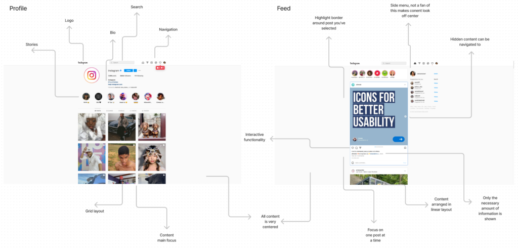
The next stage of research was looking into other existing social medias and websites that offer similar services. For example one of the sites I looked at was Instagram on desktop.

Website Design
It was incredibly important the design of this site was user friendly and navigable. From my previous research into other adoption sights it was clear a lot of them haven’t been updated in a long time. Here are some of the key parts of my design so far.
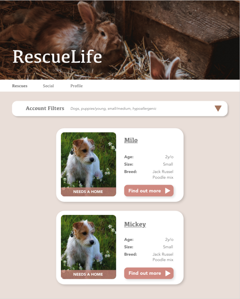
I’m am currently on my 3rd set of design updates, just refining and tidying up certain features. This is a look at my current design for the home screen where users can identify rescues. The filters bar opens up to give the user plenty of options to narrow down their search criteria.
I wanted to keep the interface really simple in design as I have experienced plenty of over clutter websites. I wanted the cards of each animal to be clearly defined and only contain the absolutely necessary information initially for the user to get an idea if they pet is suitable, this keeps my application in line with the progressive disclosure technique.
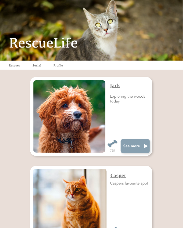
This is an example of the social page where users can interact with the rescue pets they follow. I wanted to clearly define the rescue and social portions of the sight as in design they are both lists of pets, I have begun doing this by using different accent colours between them. The blue represents all social features of the sight and the pink/brown highlights the rescue side of it.
Logo Design
Here is the progression of my logo design. After some deliberation I concluded with RescueLife as I wanted to name the application something meaningful that gave a brief description of its purpose but also sound like a plausible social media. RescueLife in terms of adoption represents that process your rescuing a life. Then in terms of social media I wanted it to portray what life is like with a rescue pet therefor RescueLife such as that ‘rescue lifestyle’ made perfect sense.
I then went though a couple iterations of logo design, initially feeling quite generic and basic to a little too detailed. At first I just played around with the name, I love the font and definitely feel like it adds a lot of character to the branding. I decided I wanted to have some sort of graphic to accompany the text to make the logo a bit more interesting I did like the idea of using lose shapes to represent some animals, and play around with the text colour a bit, however I feel that it ended up being a little too childish and hard to make out some of the smaller details. I then decided to make the shape a bit more sophisticated to match the target age group and used the silhouette of a character I had designed for the project. I really loved this but the silhouette was far too detailed and considering logos are usually quite small, the dog was not be easily identifiable, so I updated it slightly to make it clearer.


Character Design
I was pretty keen to have a character as part of the application, as something to engage with. A story to prove rescuing is a successful and rewarding process. This is why I decided to base the character of my own rescue pet – Charlie. Adopted back in 2008, despite the poorly designed, tedious websites my family was successful in finding the perfect pet. I felt like adding this personalised touch would make the application that much more relatable. Despite trying to simplify the adoption process, there is no doubt that buying a pet is faster, therefor I want to encourage my users to be as passionate and excited about pet adoption as I am and I really feel Charlie can bring this extra touch.
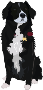
Initially I created this designed to be the character for the application, I really liked the detail and realism of the graphic, unfortunately this took a very long time and I wanted to make him with various positions / expressions to give feedback to the user. This was have taken up far too much time and the detail would be lost anyway.
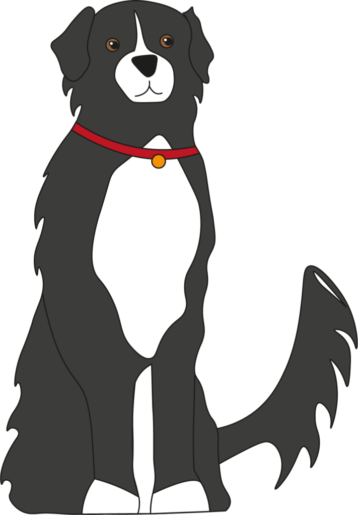
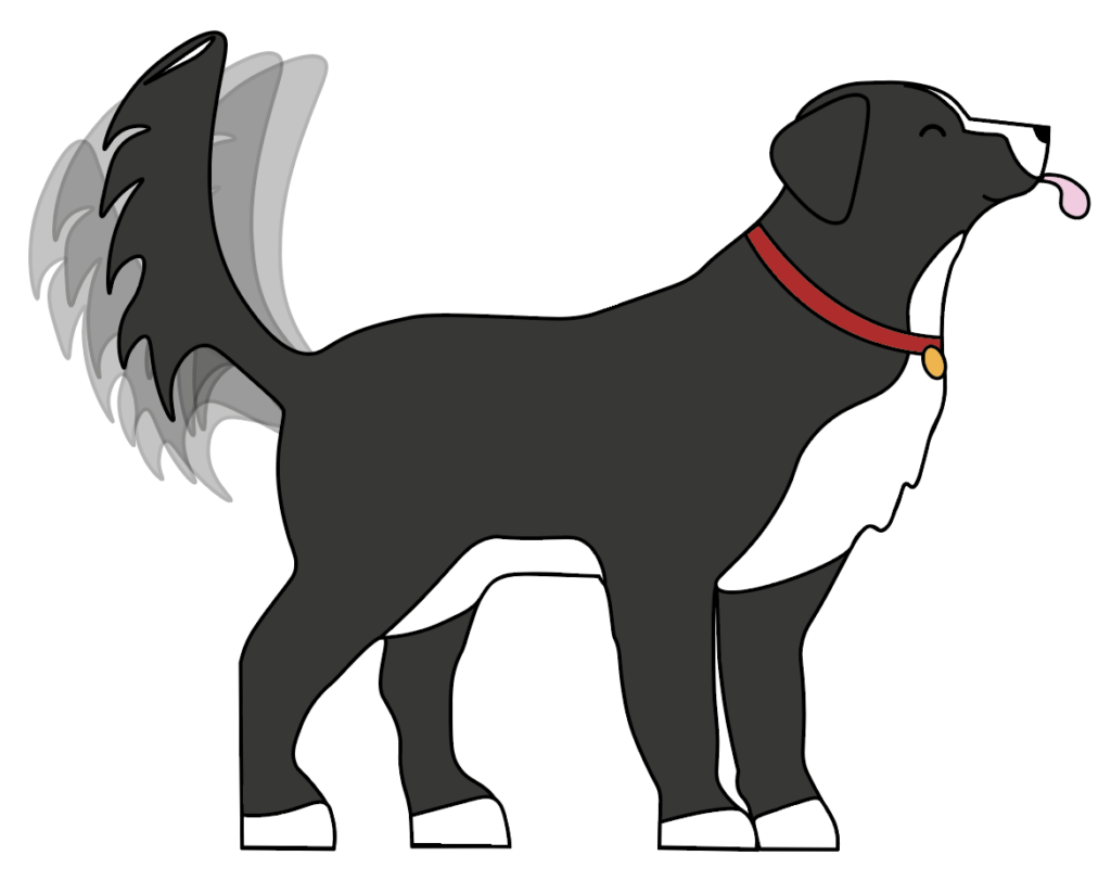
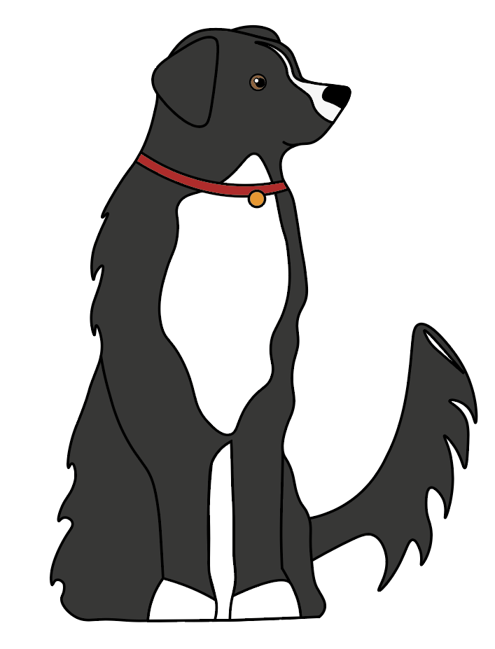
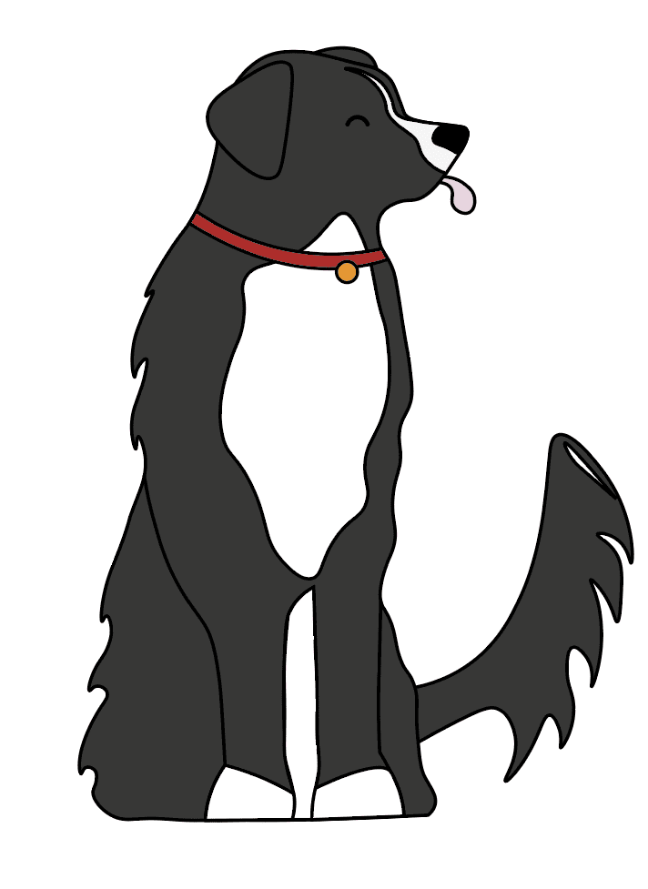
I designed this much similar version of Charlie which was far more manageable but I still feel represents him in the right way. I appreciate this design is more childish but I am not planning on putting him everywhere, just in a few locations to maintain users interest.

Coding progress
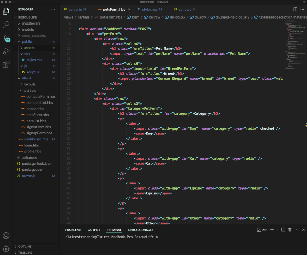
My coding has been progressing well, and I have successfully got a good communication between my code and database. I am using the handlebars structure for code organisation and node.js and mongoDB to manage my database.
There are a couple areas that are requiring more research such as sending specific data to the data base such as switches and radio buttons but I’m keen to get this working as it gives the input forms more variety.

The login and signup functionality are working well with users only being able to see their specific content.
Despite the design needing sorting, the functionality of the home screen and the filters are making progress.
